
Regarding Play
2 customers
won from prototype
50+ screens
designed for web and mobile
End-to-end MVP
designed and delivered

Regarding Play is a digital marketplace designed to bridge the gap between sports players 🤾♂️ and facilitators in a way that had never been done before. Whether you’re booking a local court, joining a casual game, or seeking top-notch coaching, Regarding Play aimed to make it all possible — right from your phone, no hassles, no fuss.
When the founder, Ary, approached me to bring their vision to life, the team was bursting with big ideas 💡 but needed solid product and design expertise to make those dreams a reality. My role was to distill their vision into a tangible product, creating mockups and prototypes to bring the idea to life — helping the company secure its first customers and set the stage for the future.
Objectives
To get a clear picture of what the team envisioned 💭, I spent a lot of time chatting with Ary and the rest of the crew to understand their thoughts, motivations, and what they were hoping to achieve with their platform. There was heaps of excitement, but with limited time and resources, we needed to figure out where to put our eggs 🥚 and focus on what would bring the most bang for our buck.
Once I had a solid understanding of the team’s needs, we aligned on a few key focus areas that served as the foundation for our work together:
- Start with tennis: This product could be used across many sports, but we needed to focus on one first. How could we build a product tailored to tennis while leaving room to expand into other sports over time?
- Identify and prioritise the most important features: With a laundry list of features to build — from court bookings to finding a coach to connecting players — we needed to figure out what was the most important to tackle first. What would deliver the most value?
- Create an impressive prototype: Like many startups, we needed a showstopper to bring potential customers and investors onboard. How could I design a prototype that would make jaws hit the floor 😲?
- Deliver development-ready screens: The team also needed development-ready screens to build off. How could we quickly iterate and deliver mockups for developers, while continuing to refine other parts of the platform?
And so, I dove headfirst into the world of sports marketplaces to solve this curly problem…
Discover
Before jumping into any design work, I wanted to get a solid understanding of the problem space and the stakeholders involved. To really get a feel for the lay of the land, I had to get in the thick of it and see what was really going on!
I joined Ary on a mission to get a first-hand look at the challenges players and venues were facing. Here’s what I got up to:
- 🏸 Booking and playing tennis locally: I figured the best way to understand the process was to experience it firsthand! The process was low-tech and painful — often involving a phone call and, believe it or not, cash payments!
- 🖥️ Researching competitors and existing online experiences: Since I could only play so much tennis, I pulled together a research doc on what experiences were out there in the market, identifying strengths, weaknesses, and any gaps we could exploit for Regarding Play.
- 💬 Meeting with potential sporting venues & interviewing staff: I needed to understand the economics behind venues — what their revenue streams looked like, what platforms they were using, and what pain points they were dealing with.
- 🤾 Talking to players and parents: I spoke to plenty of players and parents to uncover their frustrations when booking courts, signing up for coaching, or finding casual play.
With all these insights, I crafted user personas for both players and venue operators, alongside a research report that highlighted key findings and opportunity areas to focus on.
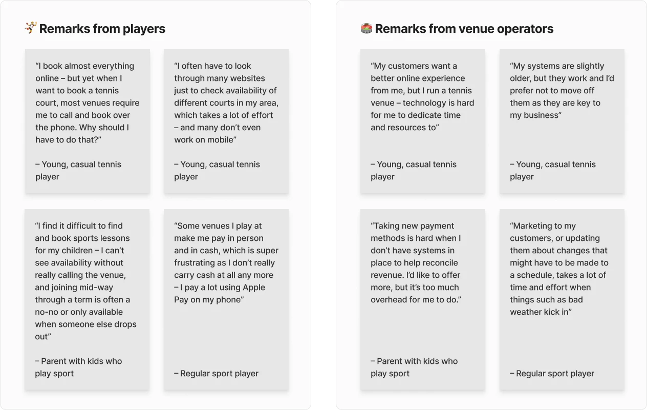
Some of the discoveries that stood out were:
- Venues had various revenue streams: Court hire was a predictable low-cost revenue stream, but bigger profits came from ‘sessions’ — coaching, camps, etc.
- Many venues’ websites were neglected: These sites were often outdated, with mobile versions either clunky or non-functional, and the venue’s offerings often buried or never online at all.
- More venues offered online booking than expected, but players were frustrated with the experience: Modern payment options like Apple Pay were nowhere to be found.
- Players were frustrated with the booking process: Court bookings were tough to navigate, and other sports services like match play and coaching had the same clunky process.
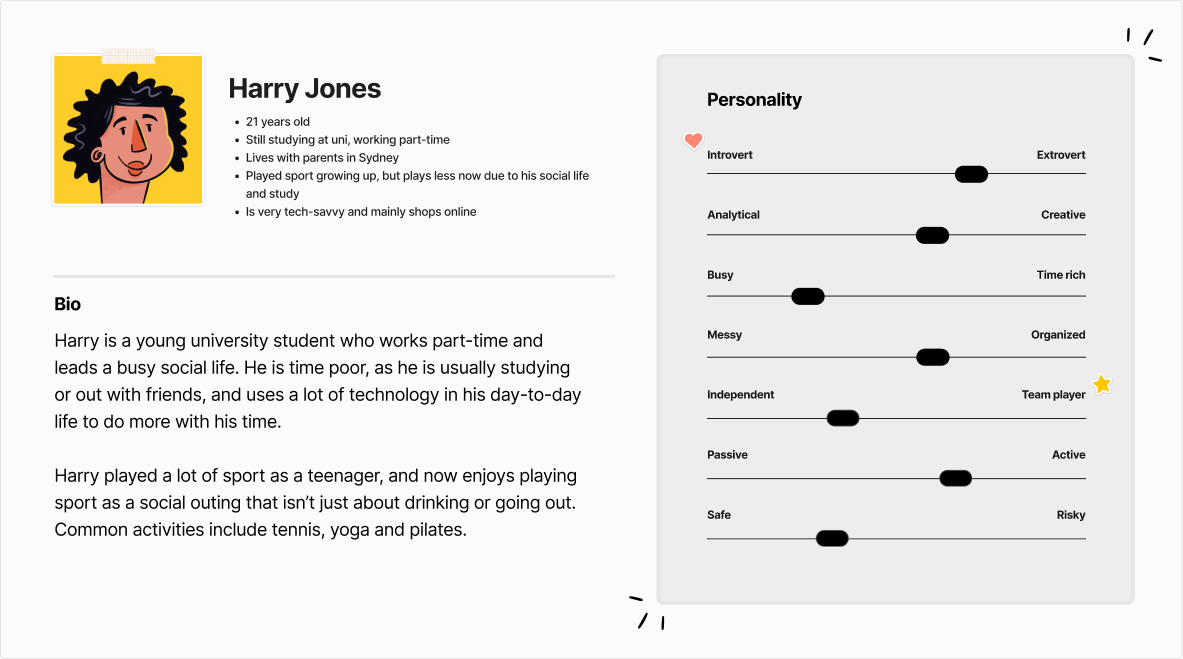
This discovery phase helped us understand what was needed to make the platform stand out and gave us a clear direction for building a seamless, user-friendly experience.
Define
Armed with the findings of my research, I sat down with Ary and the team to chat through what I had seen and the pros and cons of some potential directions to take. After some thorough debate, and a few strong coffees ☕️, we made some key strategy decisions:
- Focus on “sessions” over court hire: Sessions like coaching and camps had fewer inventory concerns, transferred well to other sports, and came with a higher average order value that made it easier to justify our commission.
- Create unique pages for each venue & session: Offering free, well-designed landing pages for venues would help us acquire cheap traffic and form the base for a long-term SEO play.
- Simplify the search experience: We wanted players to search for everything they needed in one place without bouncing between sites, and to see how popular a venue was based on social proof.
- Start with a responsive web platform: Given our resource constraints, we opted for a responsive web approach that would later translate into a PWA-first mobile app.
With these decisions in place, we were ready to move forward with the next phase of the design process. Let’s get cracking! 💪
Design
With the foundations in place, it was time to bring the product to life. The goal was clear: create an intuitive, seamless experience that was just as fun as it was functional.
Information architecture
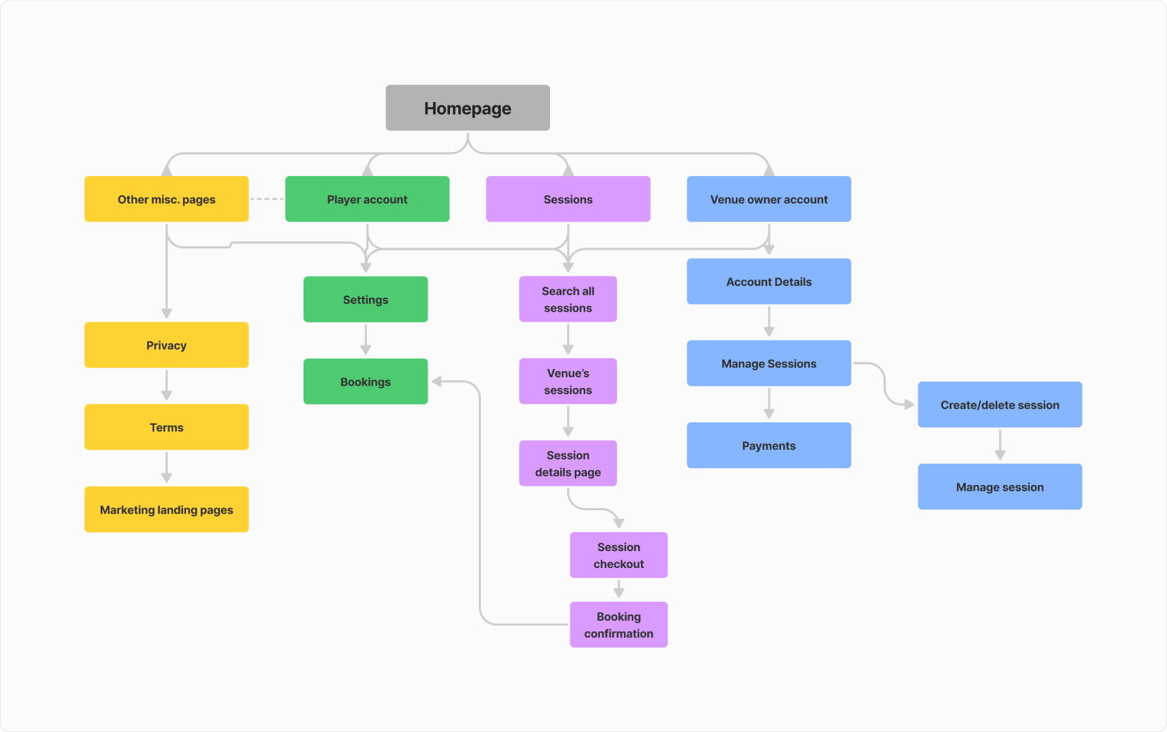
Before diving into the visuals, I wanted to make sure we had a solid set of information architecture (IA) principles in place for the platform. The architecture needed to be clean, organised, and consistent with where users would expect to find things — while leaving room to grow as the platform expanded.
Wireframes
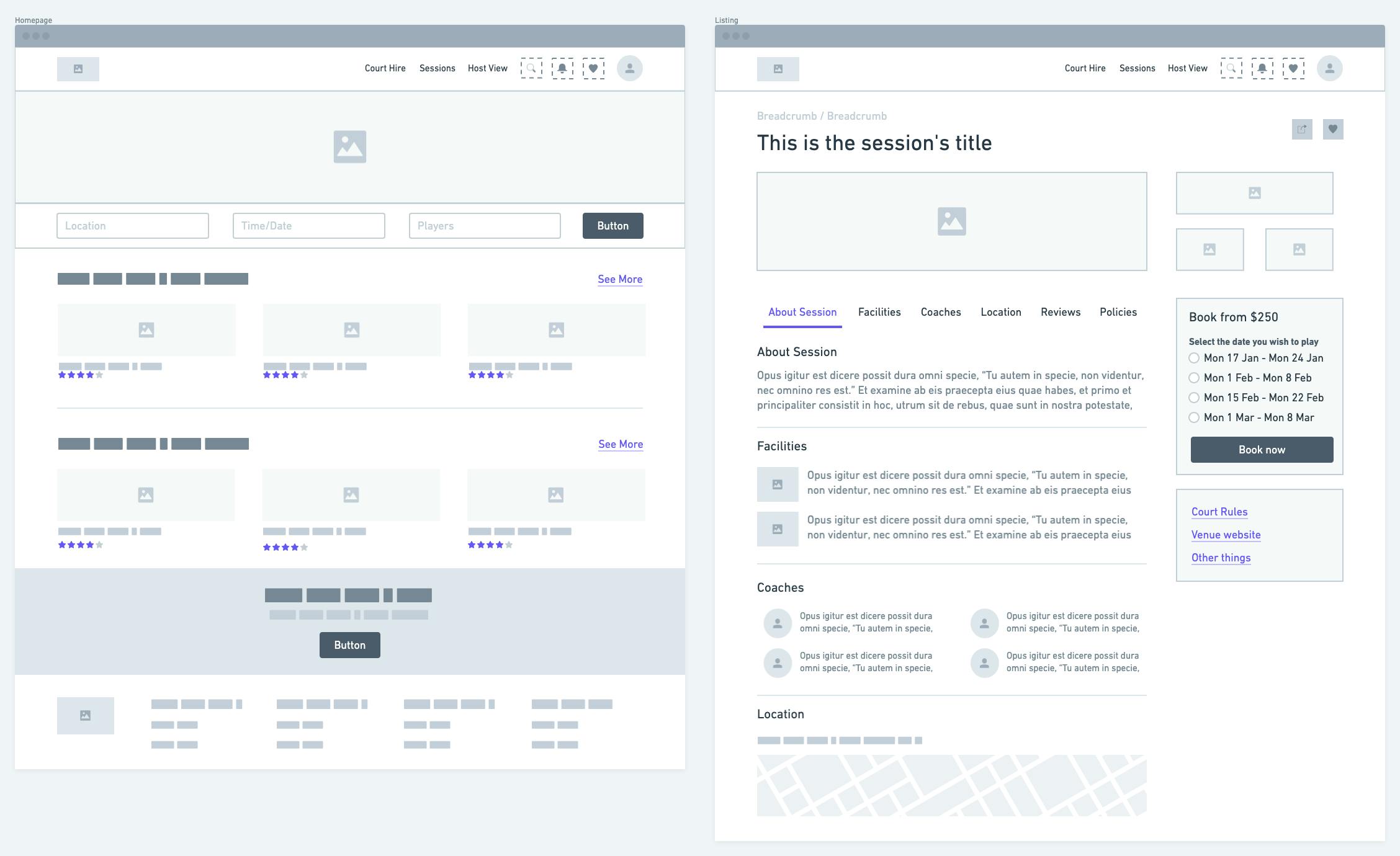
Once we locked down the structure, I sketched out the initial wireframes. These were hand-drawn first, then translated into digital versions we could iterate on quickly.
Refinement of Mockups and Design System
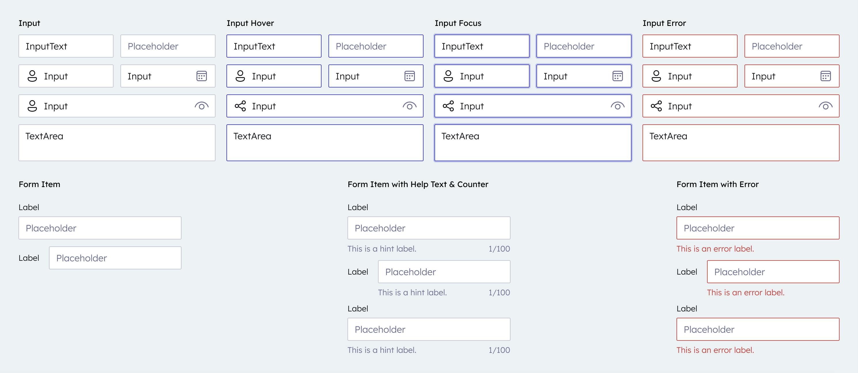
As I refined the mockups, I focused on building a design system to ensure a unified experience across the platform and reduce unnecessary development work. Everything was documented in Figma and Notion, so the team could keep things consistent as we moved forward.


Test & Refine
As the design took shape, I created a clickable prototype to test key user flows. Using Maze for user testing, we gathered feedback and identified pain points before jumping into development.
We asked users to complete key tasks like:
- Book a sports camp session
- Create a new session from scratch
- Find their bookings area and cancel a session
From this testing, we made some major tweaks to the session creation flows and venue management tools to make sure everything was as easy as possible to use. These insights were invaluable in making the platform feel intuitive and user-friendly.
Outcomes
Once we were happy with the usability of the prototypes, we were confident in moving onto documenting how key features should work in preparation for development.
I was able to sketch out key product requirement documents for each key area of the platform and translate these down into epics and stories for the team to commence development on.
From this experience, I was able to help Regarding Play:
- Win commitment from 2 potential customers using an interactive prototype to secure their place as the first foundation customers 💪
- Design and develop over 50 screens for mobile and desktop, giving the dev team the foundation to bring the platform to life ✨
- Reduce the feature list by 75%, allowing the team to focus on the MVP and make sure we nailed the core features from our research ✅

"Nathan is an incredible UX/UI Designer. We worked together on an idea for a sports web platform called Regarding Play. Our objective was to design an easy-to-use platform for sport club managers and their customers alike all while giving both Users types a high-quality visual experience. Nathan can visualise the most arbitrary system requirement and bring it to life. He's super easy to work with. He’s always down for humouring new ideas as well as bringing some of his own to the table. An all-around fantastic creative collaborator..."