FusionGrove is a SaaS platform that helps enterprise B2B sales teams unlock new revenue opportunities 🚀—whether within existing accounts or untapped prospects. By analysing data from over 50 million companies worldwide, the platform identifies whitespace, cross-sell, and up-sell opportunities, giving sales reps the actionable insights they need to confidently target 🎯 the right opportunities.
As the company’s first Product hire, I had the chance to shape the platform from its MVP through to scaling across 8 countries 🌎. During my time , I worked on a wide range of projects, but this case study focuses on the design & implementation of the Reports module. This feature not only solved a major pain point for the team, but also reduced the internal time spent on reporting by 80%.
Objectives
While working closely with the Customer Success team to drive platform adoption, one pesky challenge kept on popping up: reporting 🧮.
In the early days of the MVP, reporting wasn’t a priority. The team could handle it ad-hoc while we focused on building features to attract new customers and boost adoption. But as our customer base grew, so did the reporting burden 🏋️♀️.
Customer Success Managers (CSMs) were soon spending >40% of their time generating custom reports. This drained resources and led to a constant stream of customisation requests. I set out to solve this problem with three key objectives:
- Free up Customer Success for high-value activities. Spending nearly half their time on reporting wasn’t sustainable. We needed a solution that freed them ⛓️💥 from reporting.
- Understand what customers really need. We had a wealth of data from support channels, but the feature had to deliver real value.
- Empower customers to self-serve. By enabling customers to generate reports independently, we aimed to boost engagement and give them ownership over their data.
My responsibility was to define, design and implement a solution that delivered on these.
Discover
Research
With clear objectives in mind, I wanted to dig deep into the problem and make sure we were solving for the right things. To do this, I focused on three main sources of information:
- Customer Success Managers (CSMs): As the front line of support 🥵, they provided invaluable firsthand knowledge of customer needs.
- Support tickets: A goldmine 💰 of historical requests that highlighted trends and pain points.
- Customers themselves: By speaking directly with users, I made sure nothing was being lost in translation!
From this, my key findings (summarised for brevity) involved:
- No two reports were alike. Customers’ needs were highly bespoke—some focused on campaigns, others on salespeople or teams.
- Templates were a starting point. CSMs had developed basic templates for common report types, saving time but leaving room for improvement.
- Timing and delivery were critical. Customers wanted reports delivered on a strict schedule to specific recipients, but the manual process was cumbersome.
These insights formed the foundation of a business case presented to senior leadership. After collaboration and refinement, we got the green light ✅ to build the Reports module.
Design
Architecture
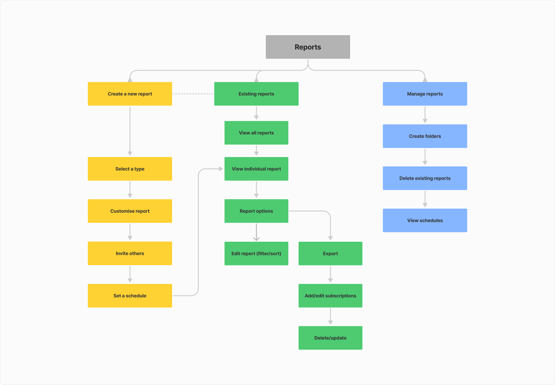
To define the structure of the Reports module, I:
- Analysed competitor platforms (e.g., Salesforce, Zoho) for inspiration.
- Conducted card-sorting exercises to validate how information should be organized.
- Sketched key user flows, ensuring scalability for future enhancements.

I created wireframes that addressed every research insight, even features that wouldn’t be included in the initial launch. These evolved into higher-fidelity designs and a clickable prototype for testing.

After rounds of internal reviews and discussions, I put together wireframes of key sections and made sure all of my research appeared within the skeleton ideas. I iterated on these wireframes through to higher fidelity designs that served as the basis for a clickable prototype.
Testing
Using Maze, I tested the prototype with a group of friendly customers. The results were promising, with most user journeys working as intended. However, feedback highlighted minor tweaks that could enhance usability, including:
- Simpler terminology: Renaming “Subscribe” to “Schedule” for clarity.
- Streamlined filters: Consolidating detailed options into a single “Filter” button to avoid overwhelming users.
- Better onboarding: Not all users were willing to learn how to use the module, and wanted some assistance in doing so.
These adjustments helped us refine the design and ensure a seamless experience.
Implement
With designs finalised, I led the implementation process which included:
- End-to-end mockups and prototypes: Building detailed screens for the team to understand the flow and states of each screen & interaction.
- Documentation: Writing detailed product requirements for the engineering team.
- Agile collaboration: Acting as Product Owner to guide development, manage sprint goals, and conduct UAT before release.
- Content creation: Drafting help articles for the new Reports module to support customer onboarding.
I worked closely with the front-end team to ensure pixel-perfect execution and addressed any visual bugs as they arose.

Outcome
The Reports module launched successfully, delivering significant impact:
- 80% reduction in CSM reporting workload, freeing them to focus on high-value activities.
- 25% drop in email requests for reports after an in-app announcement introduced the new feature.
- Over half of all customers were generating reports after month 1, indicating strong adoption.
This project not only improved operational efficiency but also empowered customers with self-service capabilities—enhancing both their experience and our team’s productivity.
